Nothing Phone (3) Intro
It has been a good two years since Nothing launched a "flagship" phone. What that would mean is a phone with more powerful hardware and the best tech the company has on hand. Yes, we've seen a Nothing (2a), a (2a) Plus, even a (3a) Pro — whatever Pro is supposed to mean nowadays. But all of these were aggressively-priced, decently specced midrangers.
The fans and the community were waiting with bated breath for the real next heavy-hitter. Needless to say, with anticipation built up and expectations so high, there are bound to be dissapointments. But did Nothing stray a bit too far from the original formula that made it popular?
The Glyph LED stripes are gone, the price has gone up to Galaxy S25 levels, and the design decisions are a bit divisive to say the least. Does any of that make the Nothing Phone (3) a bad phone? No, it's pretty solid. Does it make it a bad Nothing Phone, though?
Table of Contents:
Nothing Phone (3) Specs
On the verge of top tier
A top shelf phone needs top shelf specs, but Nothing did save a couple of quid here and there:
| Nothing Phone (3) | Samsung Galaxy S25 |
|---|---|
| Size and Weight6.32 x 2.98 x 0.35 in(160.6 x 75.6 x 9 mm)218 g | Size and Weight5.78 x 2.78 x 0.28 in146.9 x 70.5 x 7.2 mm162 g |
| Display6.7-inch OLED120 Hz, 4,500 nits peak2800 x 1260 px | Display6.2-inch AMOLED120 Hz, 2,600 nits peak2340 x 1080 px |
| ProcessorQualcomm Snapdragon 8s Gen 44 nm, 3.21 GHz | ProcessorQualcomm Snapdragon 8 Elite3 nm, 4.47 GHz |
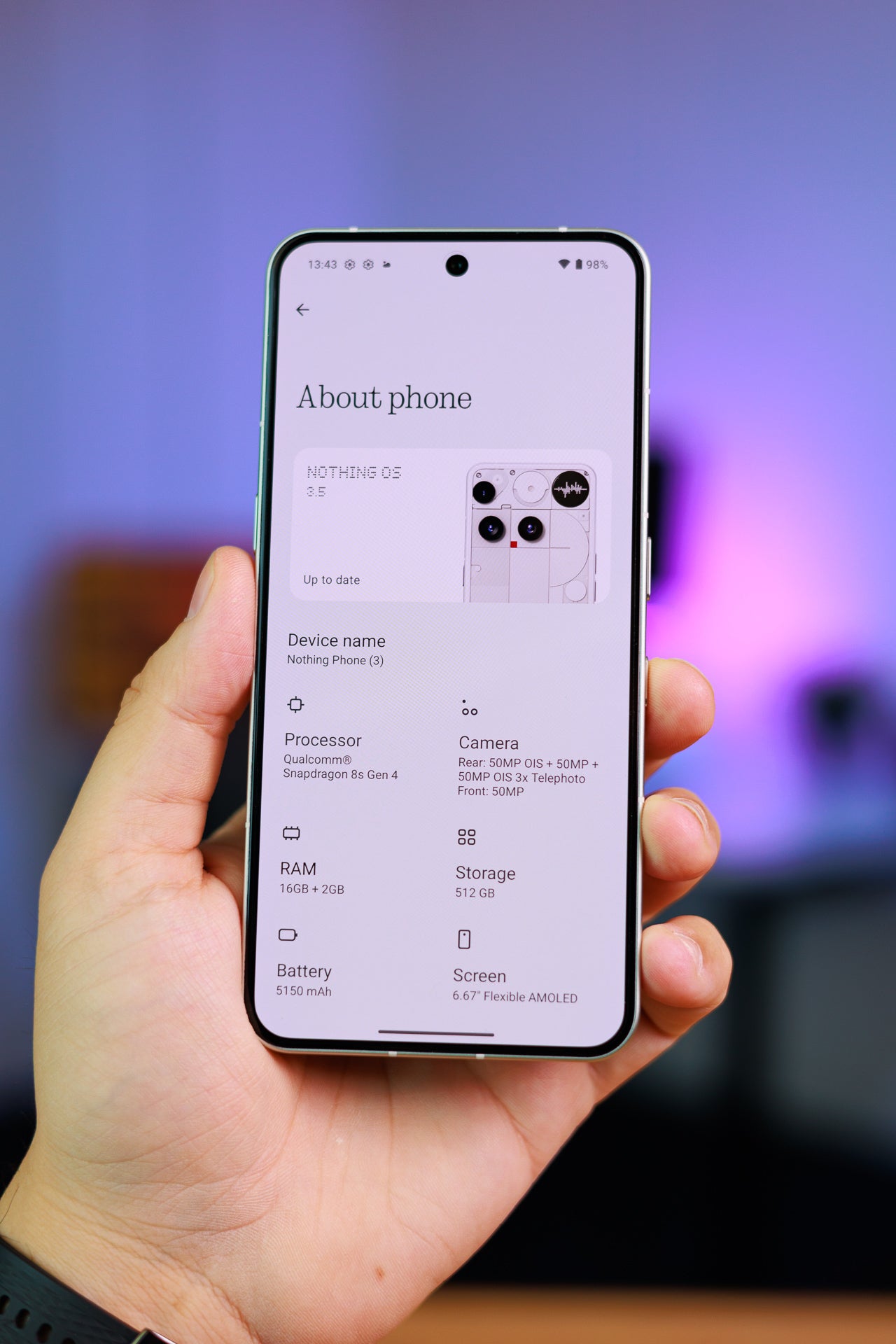
| SoftwareAndroid 15Nothing OS 3.5 | SoftwareAndroid 15One UI 7 |
| Cameras50 MP wide, F1.750 MP ultra-wide, F2.250 MP 3x telephoto, F2.750 MP front | Cameras50 MP wide, F1.812 MP ultra-wide, F2.210 MP 3x telephoto, F2.412 MP front |
| Battery Size5,150 mAhSi-Carbon | Battery Size4,000Li-Ion |
| Charging Speeds65 W wired15 W wireless | Charging Speeds25 W wired15 W wireless |
| Prices12 GB / 256 GB - $79916 GB / 512 GB - $899 | Prices12 GB / 128 GB - $799.9912 GB / 256 GB - $859.99 |
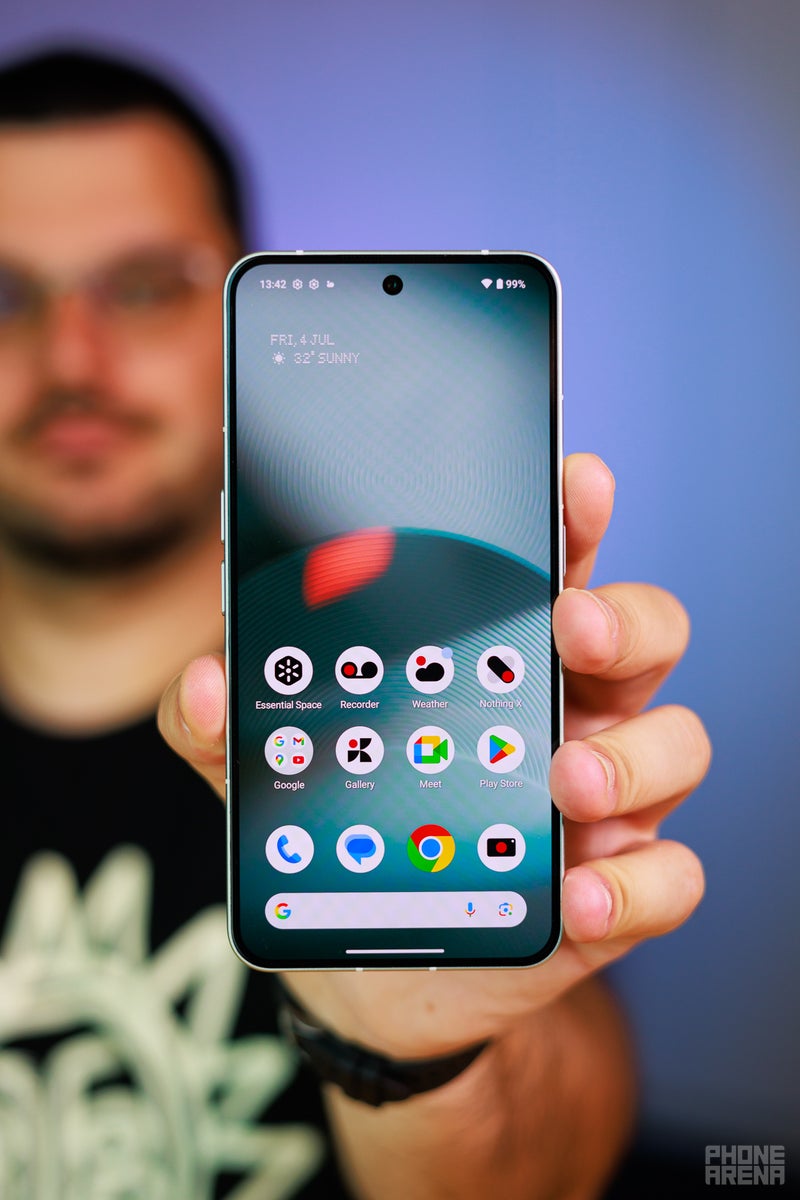
Nothing Phone (3) Design and Display
So long Glyph, hello little circle thing
Yes, I know, I will address the Glyph ordeal, but let's go through the main design things first.
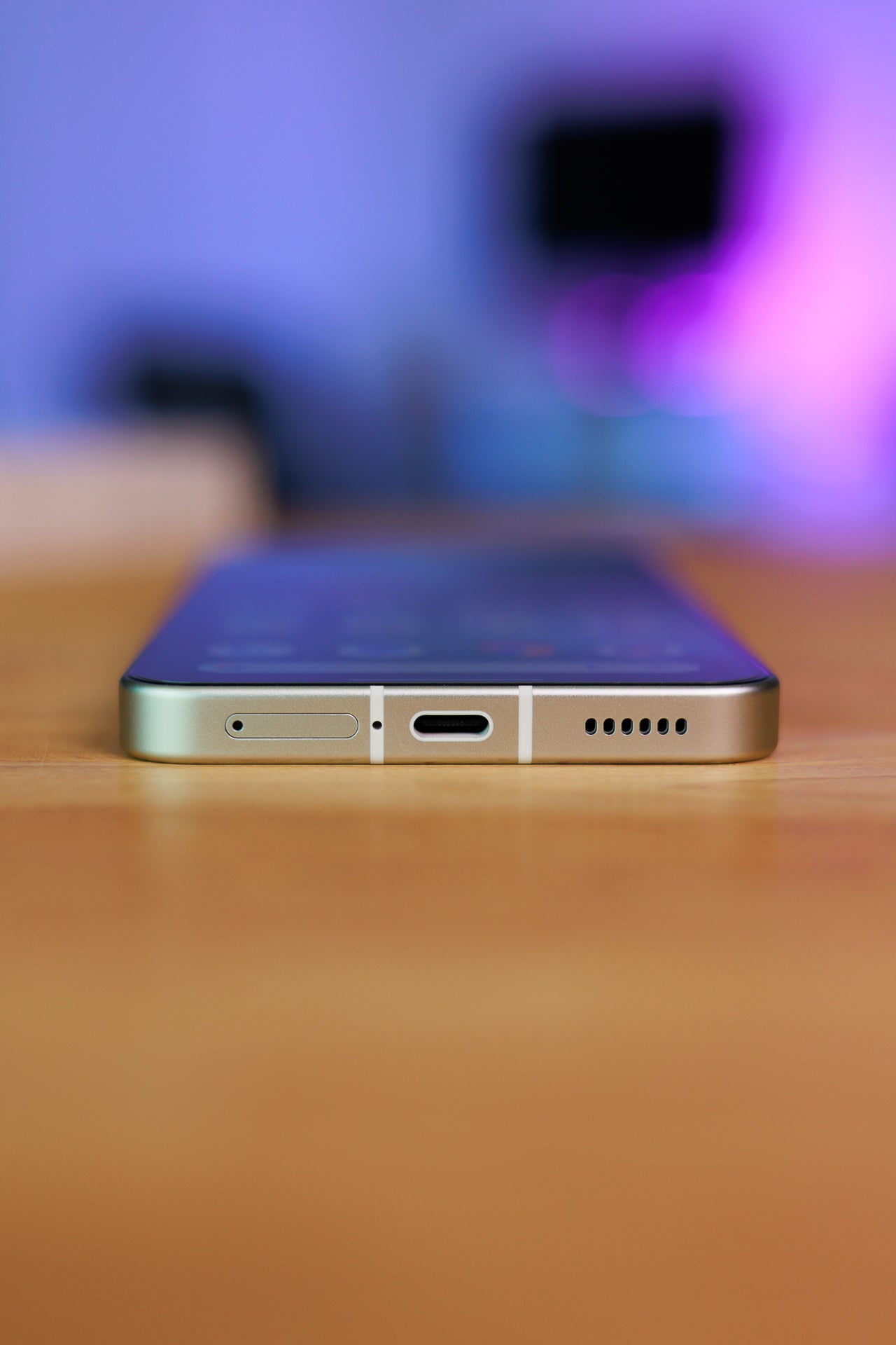
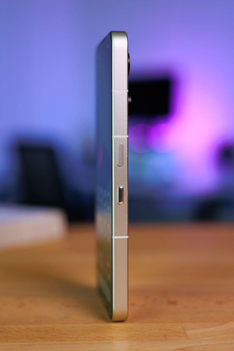
The Nothing Phone (3) feels great in the hand. It's a solid aluminum frame with soft edges and a soft matte finish. The back is glossy, due to the whole "transparent" thing, so it does attract fingerprints, but at least it's not very slippery in the hand (on a desk — it's a different deal). The buttons are a bit shallow but not wobbly, and decently clicky.
And yes, there are four buttons — one sleep / assistant button, two for volume, and the Essential Key that was introduced with the Nothing Phone (3a) series. It's effectively a screenshot button that can also record a voice note if you hold it, and will use AI to sort and compile the information on said screenshots. Kind of a "reminder" on steroids.
Overall — and I know we hate saying this, but it's kind of true — it has a bit of an "iPhone"-ish feel, in a good way.
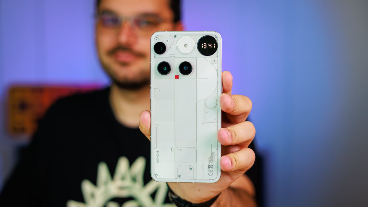
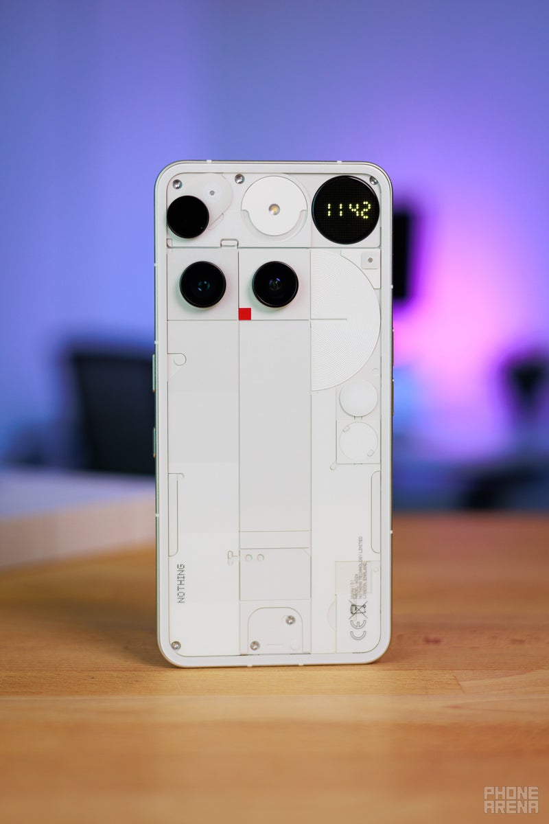
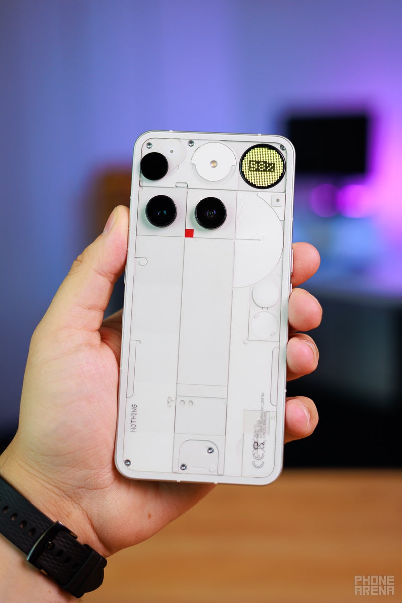
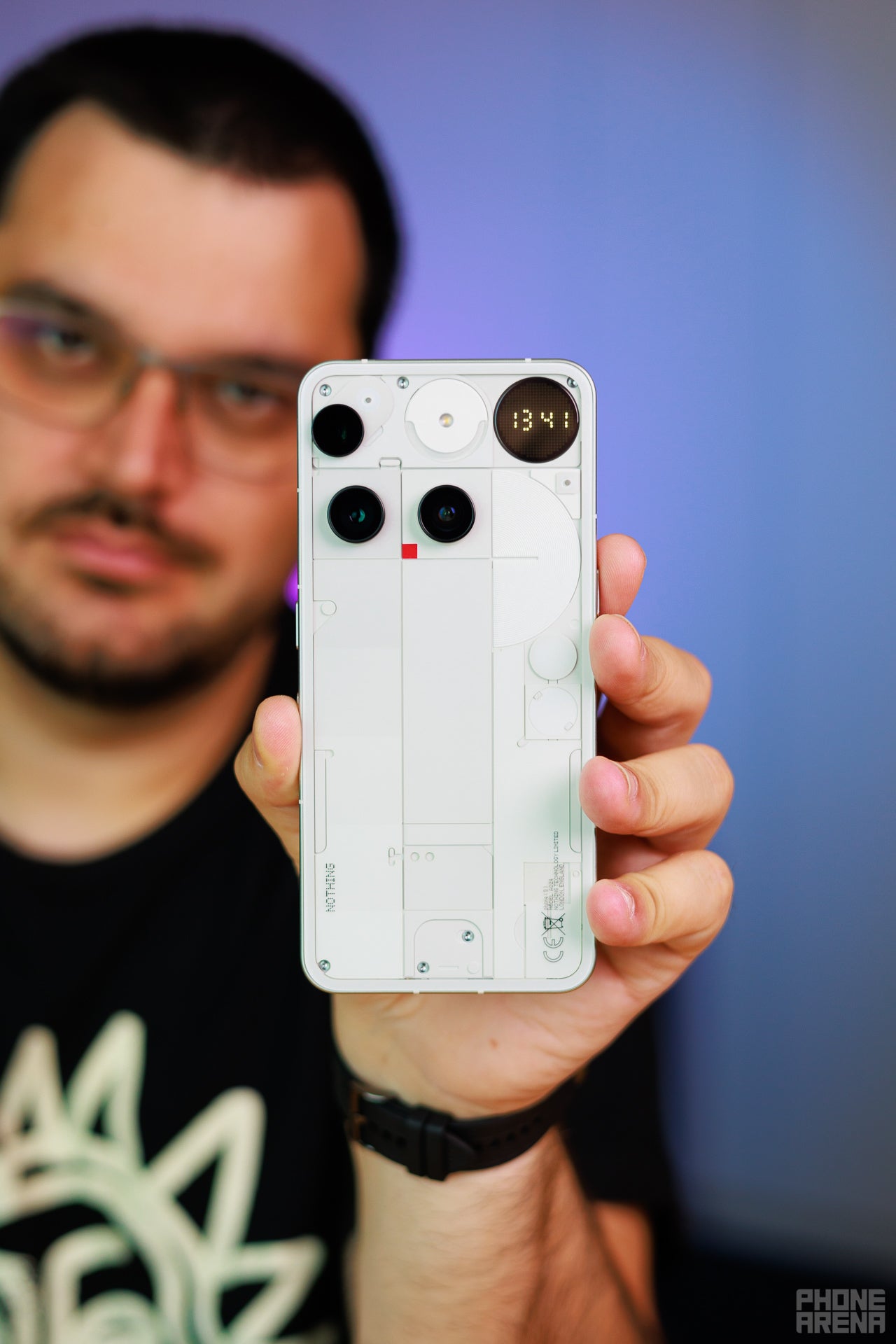
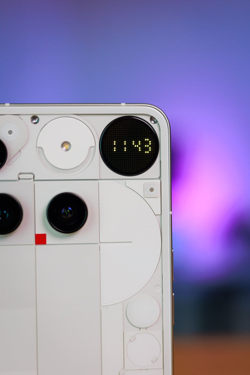
Well, until you flip it over and look at that camera arrangement. I know it's early days, and we may get used to it, but that design has the Internet going wild. It kind of looks like it tries too hard to be different. I am not sure this is a bad thing, really — in the year 2025, we certainly could use "different" in the smartphone world.
It looks kind of geeky, kind of eccentric, but I wouldn't say overbearing. Perhaps pictures and video make it look worse than it is — in real life, I wouldn't say the phone is "ugly". Kind of charming, if I am honest. Do I wish the zoom camera didn't appear "droopy"? Yeah. Am I focusing on that specifically because I read it in an Internet comment? Also yes. Does it bother me otherwise? Not really.
But taste is subjective, and I am sure Nothing knew full well not everyone is going to be a fan of this new direction. We could kind of see the seeds being planted with the Nothing Phone (3a) Pro and its scattered camera design. This feels like an evolution of that concept. Might be a misstep, might not — we'll see once the dust settles.
However, here's one thing that angered pretty much the entire Nothing fanbase:
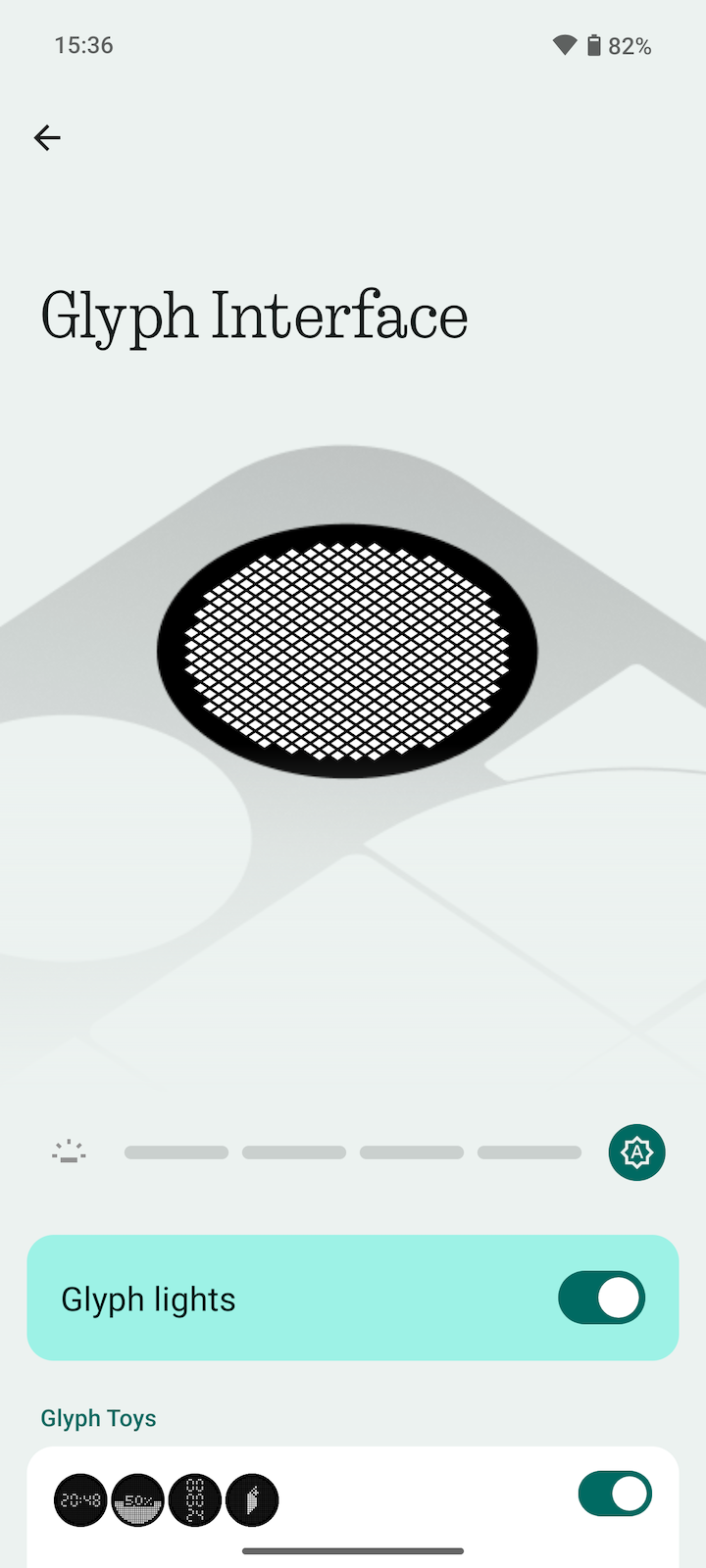
Let's talk about the Glyph Matrix
It is absolutely not possible to talk about this phone without mentioning the fact that the Glyph LED strips on the back are gone. Why not? Because Nothing has spent a good three years to hammer it into our minds as the "signature thing" of a Nothing phone. It was the very first thing that was teased about the original Nothing Phone (1) — no cameras, no materials, just a cryptic shape that turned out to be the Glyph upon final release.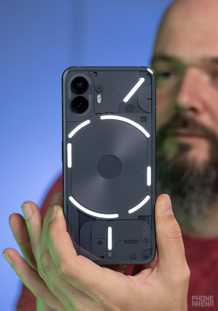
The Nothing Phone (2) expanded it further with more strips. The midrange (2a) and (3a) series had a smaller version of the Glyph, to kind of underpin that they are not like "the big dogs".
It is now replaced by the "Glyph Matrix", which is a fancy way of saying "small, low-res, monochrome screen on the back of the phone". Effectively killing the brand identity and angering the fanbase that Nothing has accrued over the past three years.
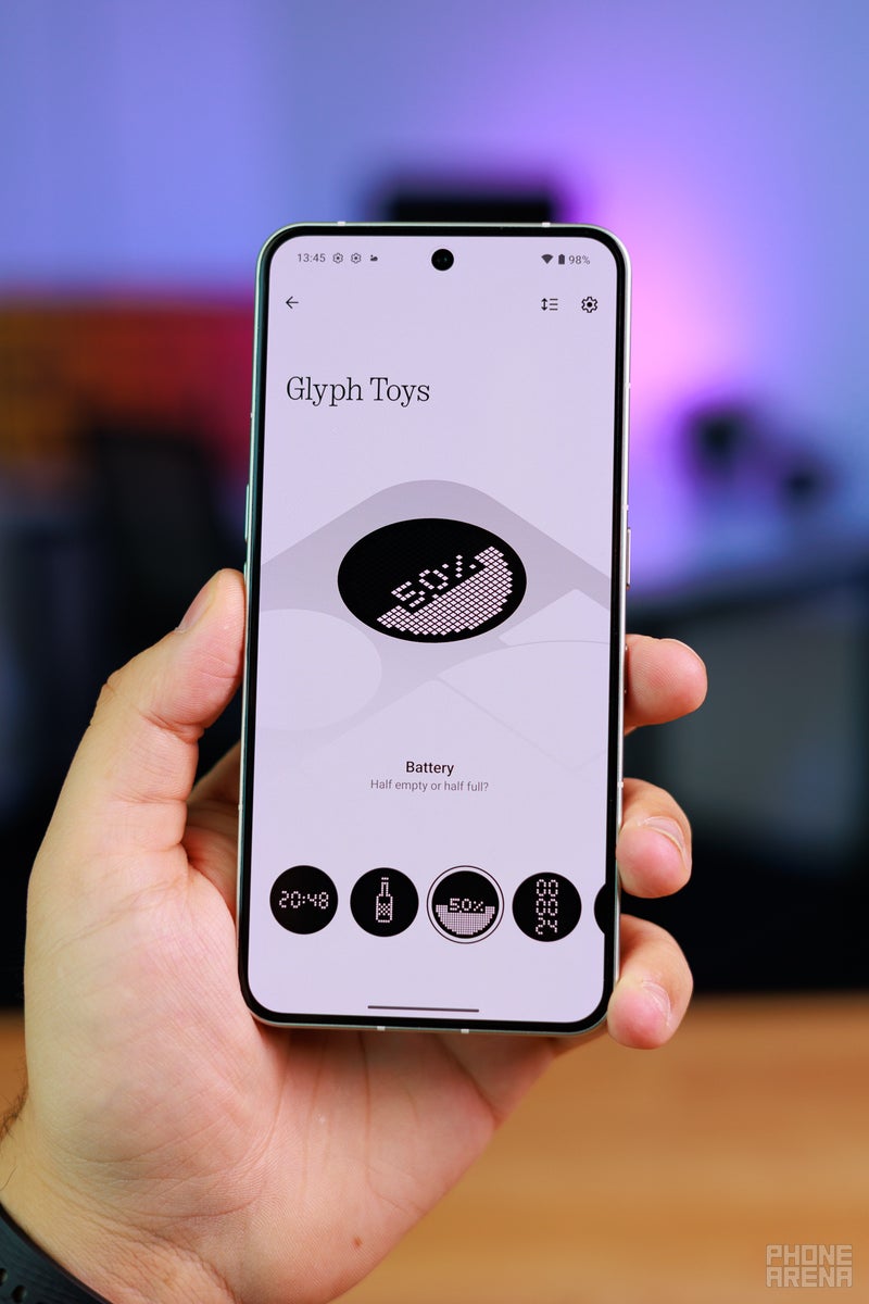
Real talk: the Glyph LEDs were not that useful. They were just fancy, they lit up in different patterns with different ringtones, and two of them acted as progress bars — one for charging the phone, one for a pomodoro timer (could also sync with 3rd party apps like Uber).
But, they were cool on multiple levels. The shape, the fact that each of the 900+ LEDs had to be specifically sourced to make sure it matches the white temperature of the others, the fact that they gave the phone a good reason to have a transparent back, you could also use them as a soft light for the camera. Geeky things, but you are a startup brand, the enthusiasts are your core audience.
The new Glyph Matrix, by comparison, feels a lot less special. It's a 25x25 display on the back that can show you a clock, actual notification information, as well as play a few games — Magic 8-ball, Rock Paper Scissors, Spin the Bottle. Yup, we've seen something similar on the recent ROG Phones. Come to think of it — it makes more sense on a decked-out, all-in gaming smartphone, not so much on a sleek, clean, "we put transparency between you and technology" type phone.
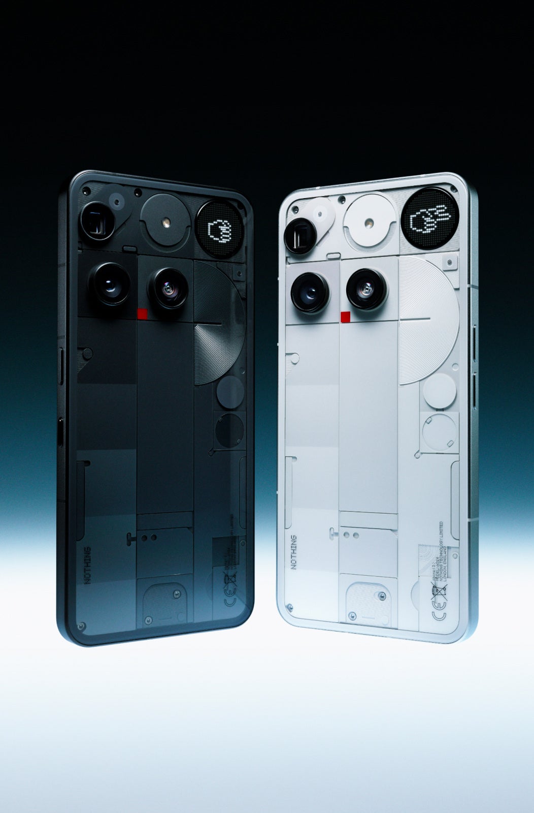
The Nothing Phone (3) comes in two colorways — white and black. Each looking pleasantly sleek and minimalistic. If history teaches us anything, it's that we may see an exclusive "community" color launch in a couple of months, but of course, we have no way of knowing if that'll happen for the new flagship.
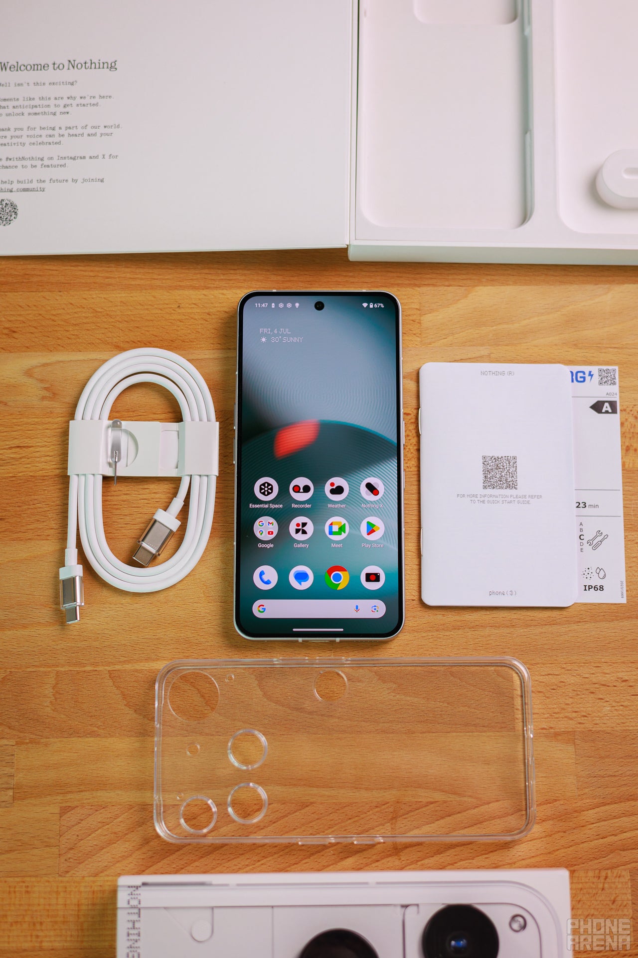
Nothing typically has a slim box with the essentials — booklet, cool cable, and SIM card tool. No changes here!
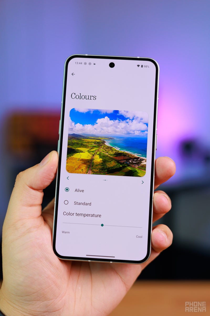
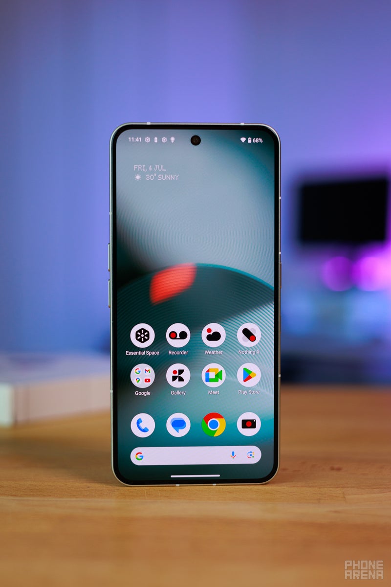
The display on the front is a spacious 6.7-inch panel, 20:9 aspect ratio. It's an OLED, as pretty much any top tier phone today, with a 120 Hz refresh rate. Its colors are punchy, as expected, and can be dialed back with a Standard color mode in the settings.
Display Measurements:
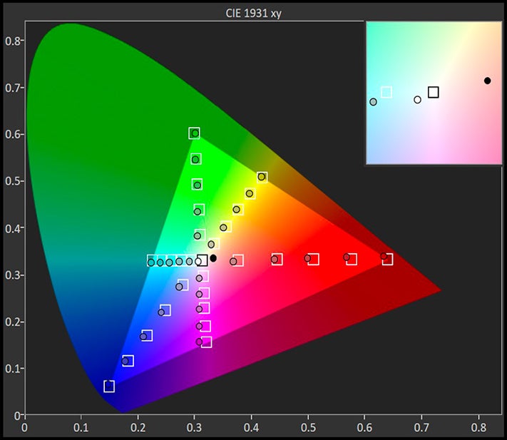
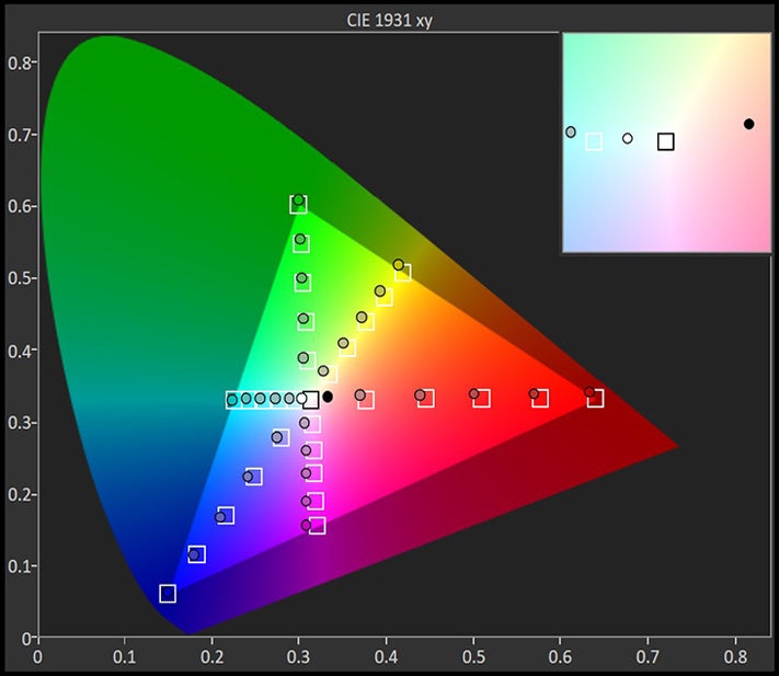
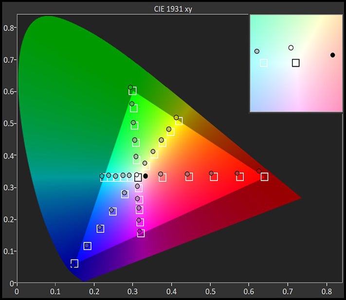
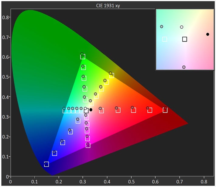
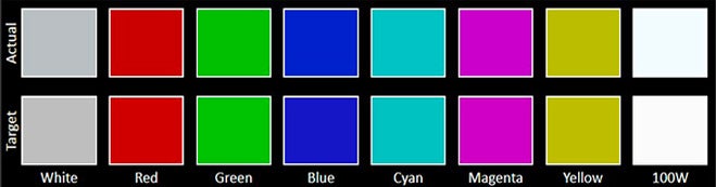
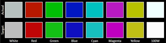
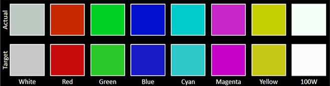


The screen's temperature does feel a bit cool when viewing and our measurements confirm that. I did dial the warmth slider in a little bit within settings, for my own preferences. The peak brightness may be listed at 4,500 nits, but that doesn't tell you much about everyday use. We measured 1,500 nits at 20% APL, which is a bit more representative for real life use. And that's an OK brightness, but behind competing top-tier devices.
The phone has an under-screen fingerprint scanner. It's optical tech and it works pretty snappy, but is a bit more capricious than ultrasonic tech.
Nothing Phone (3) Camera
Looks weird, how does it work?
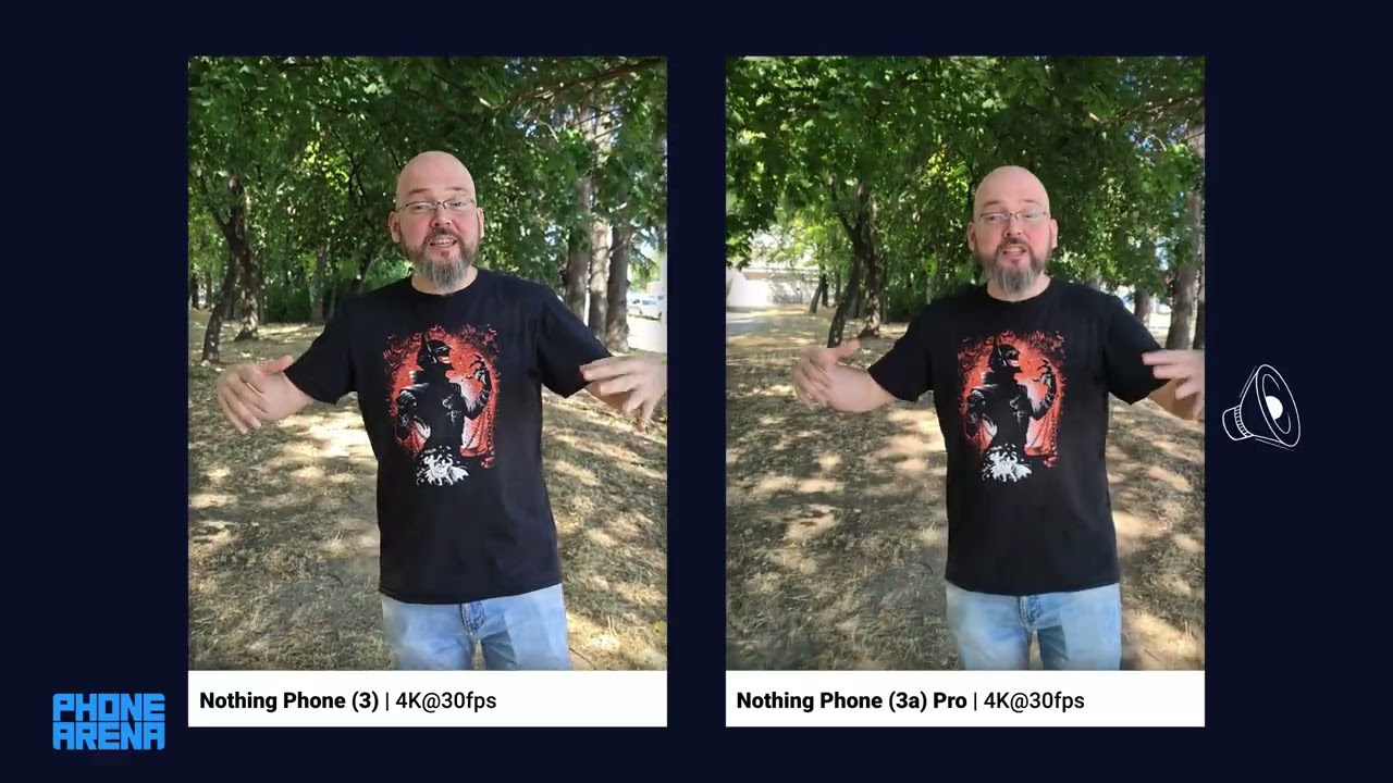
Video Quality
Nothing Phone (3) Performance & Benchmarks
Snapdragon who?
Apparently, there's such a thing as a Snapdragon 8 Gen 4. To be exact — Snapdragon 8s Gen 4. This is the first publicly-launched phone with the new processor, but what is this silicon?
It seems it's been engineered to have about the same performance as the Snapdragon 8 Gen 3, with maybe some slight graphics improvements. It's built on a 4 nm process and hits top speeds of 3.21 GHz. You could look at it as the old chip in new clothes. That kind of mirrors the Nothing Phone (2) launch — it also came with yesteryear's flagship processor at the time (that was the Qualcomm Snapdragon 8+ Gen 1).
CPU Performance Benchmarks:
And there's that performance kicking in — while very definitely better than the midrange Nothing Phone (3a) Pro (ha, "Pro"), it kind of lags behind the mainstream flagships of today. These are just numbers, of course, and bragging rights. We do find the Nothing Phone (3) to be fast, snappy, and responsive as is. But, we still have to look at the numbers for a $800 phone and compare it to other $800 phones, right?
GPU Performance
The GPU scores are pretty good. Yeah, it does get beat out by Snapdragon 8 Elite phones, but notice the "Low" score. This is as low as these phones will go when they throttle. When the heat rises up the Nothing Phone (3) is keeping pace quite well, while the rest fall behind!
Nothing Phone (3) Software
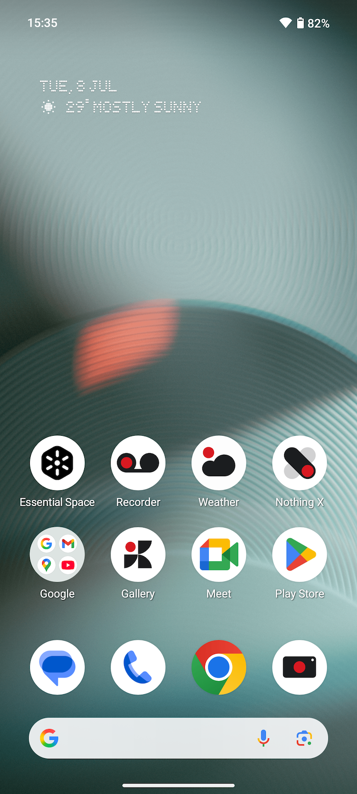
The Nothing Phone (3) ships with Android 15, with the custom Nothing OS 3.5 interface on top. It's mostly a clean Android reskin with a monochrome styling, dot matrix letters, and some cool widgets added. Oh, plus my favorite — large folders for the homescreen, but that feature is slowly gaining popularity among other phone brands as well.
And, of course, there's the Essential Space, which is basically a Google Screenshots app on steroids. Take a screenshot of an event poster, a location, a set of phone numbers, or a to-do list and the AI will identify them, create alerts and notifications, or plans for you. You can also look for old screenshots thanks to the AI tags. Useful, sure, we are still not sure if it needs its own hardware button on the phone.
Nothing Phone (3) Battery
Si-Carbon goodness

The Nothing Phone (3) comes with a 5,150 mAh battery. Not huge, but definitely breaking that 5,000 mAh barrier of modern flagships. Also, considering the phone's body and weight — pretty impressive.
Of course, that's because it uses Si-Carbon. That's a variant of the well-known Li-Ion tech we currently have on most phones. Si-Carbon can hold more capacity or be more powerful, but face challenges with longevity. Time will tell if Nothing broke the code on better-enduring batteries after a few hundred charging cycles are up!
PhoneArena Battery Test Results:
For now — the results show that the Nothing Phone (3) is steady and dependable, though not record-breaking. We've seen phones make their way well to the 20-hour mark on our browsing test. However, 9 hours in the gaming test and 10 hours of non-stop video playback is absolutely nothing to snark at.
Real life use pretty much reiterates what the tests say. I can comfortably use the phone throughout the day and forget to charge it at bedtime. Next day — a quick top-up will be enough to keep the red battery icon at bay.
Nothing Phone (3) Audio Quality and Haptics
The Nothing Phone (3) speakers are functional, but not wowing. They do have quite a lot of volume and a roomy projection to them. Not a lot of bass, but they don’t sound thin, too. The mids are pronounced, with the upper midrange being a bit “shouty” — they aren’t amazing for music, but get the job done for alarms, ringtones, podcasts.
Clicks and clacks from the feedback engine are quite precise and pleasing. That's a signature of Nothing phones ever since the first one!
Should you buy it?
There's no way around it — the Nothing Phone (3) will disappoint diehard fans of what the company has put out so far. It's more expensive — up to flagship territory, but not as powerful as the big boys on the market. It's done away with the signature Glyph and replaced it with a more bland version of that. The transparent elements on the back? Nothing transparent about that, it's just a design made to look pretty under glass.
That said, if you still have an open mind about the brand and its shenanigans, there's a lot of phone to be enjoyed here. The Nothing Phone (3) performs well, the camera may not be top-tier but it's definitely fun, and the overall device feel in the hand is pleasing. Nothing does want to make tech "fun and effortless" and this phone still carries that feeling, even if getting any fun out of the Glyph Matrix feels very effort-ful right now.
Should you buy it? I'd say if you are curious about the brand, a Nothing Phone (3a) Pro may be a better point to tip your toes into, for less money. But if you are looking for a solid phone with good specs, and one that's not "just like the other ones" — yes, the Nothing Phone (3) is pretty good!