Google has been busy, busy, busy giving its Android apps Material 3 Expressive makeovers. I have to say that, for the most part, these makeovers have been well done.The changes made to the UIs of these apps have made them easier to use, more useful, and in many cases, the Dynamic Color feature brings in the main color theme from your phone's wallpaper improving the look of the app. The Google Contacts app is now getting its makeover. The update is rolling out now via the Google Play Store.
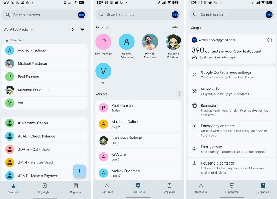
The new look Contacts app has a bottom bar that is shorter, although the three tabs, Contacts, Highlights, and Organize, remain the same. Pressing on any of the three tabs reveals a major UI improvement as each name is now in an easier to see rounded container, making it easier to see exactly which name you are clicking on. Previously, there was no clear-cut separation between the names of the contacts.
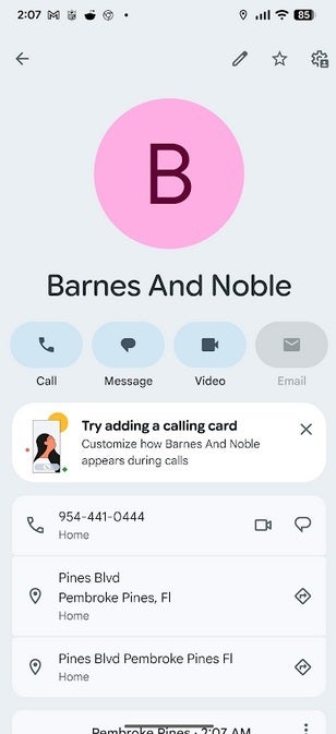
Each individual contact also gets a card with a giant avatar and the name of the contact underneath. Directly below the contact's name are four options:
- Call
- Message
- Video
The big change to this card with the makeover is that the names of these four actions are now placed inside a pill-shaped field. Previously, the four actions were placed inside of a simple circle. The new look has been found on version 4.6.1.x of the Google Contacts app.
To see which version of the app is running on your Android phone, tap on Settings > Apps > See all xxx apps. Scroll down to Contacts and tap on it to visit the Google Contacts App info page. Scroll down to the bottom of the page to see the version of the app installed on your device. My Pixel 6 Pro running Android 16 QPR1 beta 3.1 does have the refreshed version of the Contacts app.
The Material 3 Expressive refresh for Google Contacts might not be the most jarring. Nor is the Contacts app the most heavily used app on your handset. Still, with all of this in mind, Google still worked hard on this makeover; it is enough of an improvement to make the Contacts app more useful and easier for users to employ.