Home > Google Messages loses a distinctive element
Google Messages loses a distinctive element
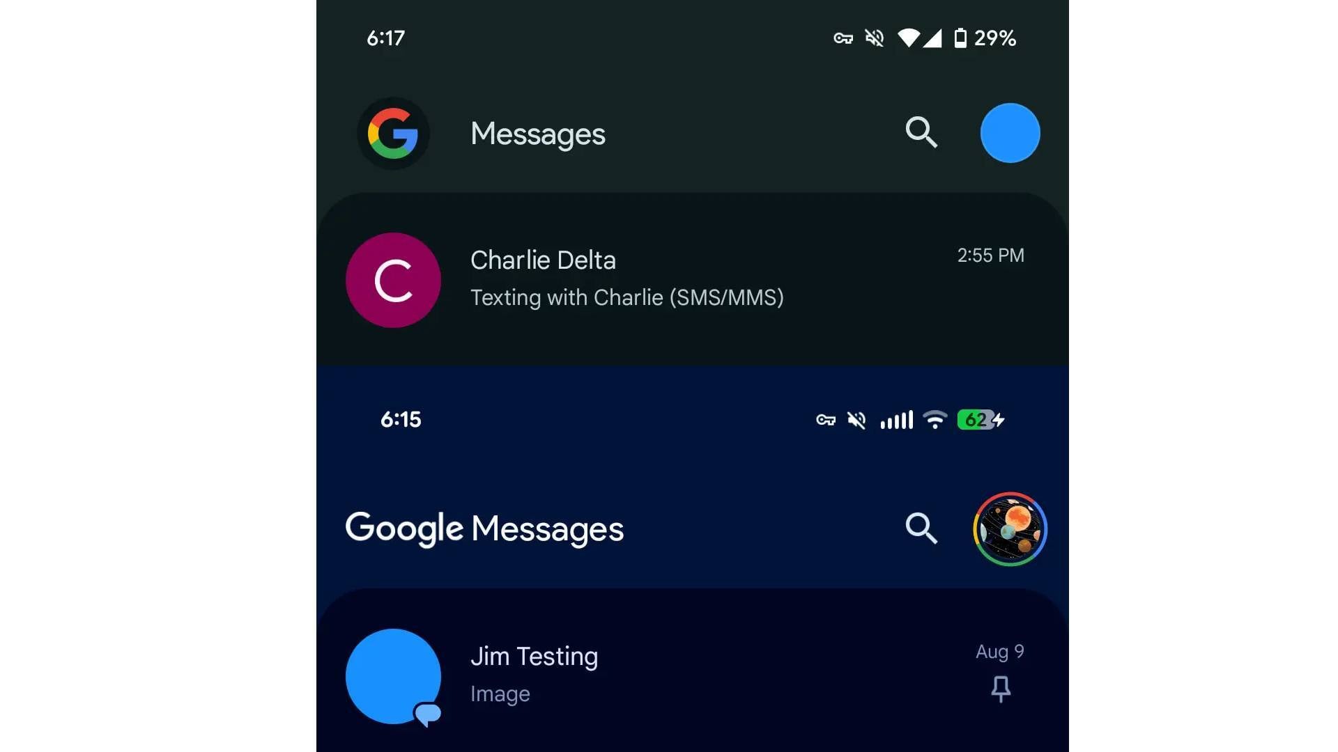
A July report said that Google Messages would drop the 'G' logo, and the change is now in effect for some users.Previously, when you launched Google Messages, Google's 'G' icon greeted you, but the app's full name has replaced the logo for some users, per 9to5Google.The app has been receiving the Material 3 Expressive treatment for some time, and a new update has brought more of Google's new design language to the messaging client. There are no longer individual boxes for each row. Instead, everything is grouped in a single container, with bigger contact photos for a tidier look. The app and status bar are now merged.The most notable change is, of course, the rebranding. The full 'Google Messages' branding is only live for beta users. It's composed of the "Google" wordmark and "Messages" in a standard font.
Those using the stable version of the app will continue seeing the 'G' logo in the top-left corner. The logo is now in a circle, though, just like the circle for the profile menu adjacent to it. This gives the design more uniformity and neatness.
Google Messages is shipping the changes steadily, with each screen becoming increasingly more Material 3 Expressive-tinged. Thus, don't be surprised if you don't see all the changes at once.
Which Google Messages branding do you prefer?
Either one is fine.
46.97%
The logo.
31.82%
The full name.
21.21%
At this point, the "G" logo is synonymous with Google, and most users can already deduce who the app belongs to. Regardless, this is a direction the company has taken with many of its popular apps, including Photos, Calendar, and Drive.The full text makes apps instantly recognisable, though, which could be why Google decided to drop the iconic logo and stamp its apps with the company's wordmark. Google Messages is one app that's always changing, and Google never shies away from rolling back unpopular changes. In case this one proves to be a decision that the company regrets and users dislike, we may see the app revert to the 'G' logo.
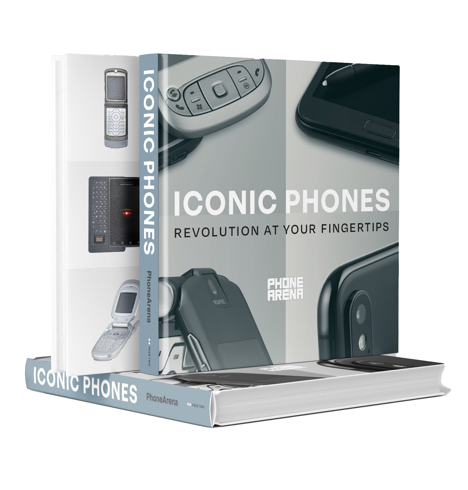
"Iconic Phones" is coming this Fall!
Good news everyone! Over the past year we've been working on an exciting passion project of ours and we're thrilled to announce it will be ready to release in just a few short months.
"Iconic Phones: Revolution at Your Fingertips" is a must-have coffee table book for every tech-head that will bring you on a journey to relive the greatest technological revolution of the 21st century. For more details, simply follow the link below!